Insight
Saudia relaunches ‘new’ retro brand and it works in stark contrast to Riyadh Air
Share:
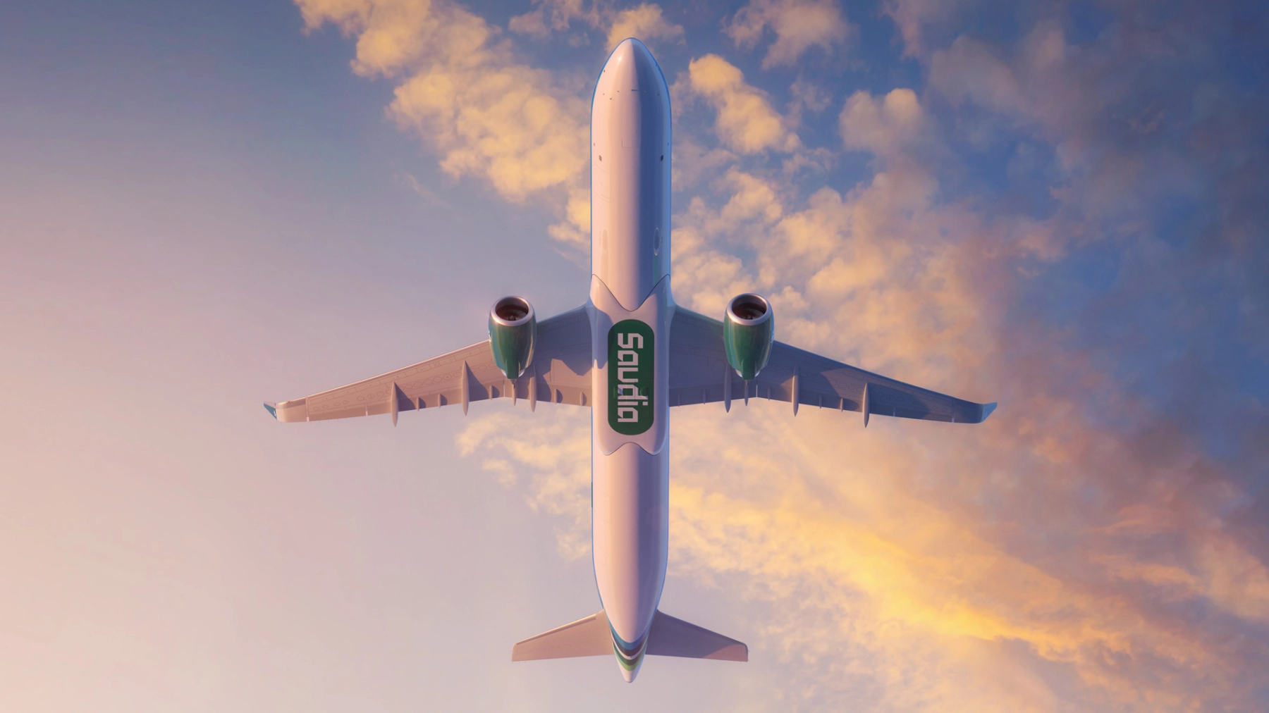
Now those with a good memory will notice that the announcement of Saudia’s new brand feels a little bit familiar. That’s for good reason. Saudia’s latest livery is actually a previous incarnation of the brand image from the 1980s. A time when futurism was based on a mix between brutalism and pixelated screen technology, which led to many geometrically led brands and typefaces.

A few years ago, the airline celebrated its 75 years flying with a ‘retro-jet’ that featured the very same livery and brand image that was revealed as the master brand for the carrier yesterday at a lavish ceremony. The airline’s press release states “This new identity is in line with a wider strategic digital transformation plan aimed at strengthening the airline’s support for the Kingdom’s Vision 2030 to bring the world to Saudi Arabia.”
The new brand colour identity, comprised of green, blue, and sand, represent “Saudia’s aim to expand its fleet and destinations, connecting the world to Saudi Arabia, emphasizing the Kingdom’s authenticity and deep-rooted values.” Although it’s no secret that the fact Saudia used to use touches of purple – which is now the new colour of Riyadh Air. There was probably a deep-rooted desire to distance itself and build an almost opposite colour spectrum to increase brand resonance in the years ahead. Green, is also the colour of the national flag.

It’s increasingly becoming evident that while Riyadh Air will take its seat in the country’s capital, Saudia wants to be portrayed as the national legacy carrier in the Saudi Arabia’s second largest city. I can’t help but see this as a pseudo British Airways vs Virgin Atlantic battle, and while new entrant is here to ruffle feathers, Saudia won’t rest on its laurels – even though both carriers are funded from within the country.
In parallel to the rebrand, Saudia has also undertaken a huge digital transformation, entirely enhancing the customer digital experience. Saudia leads among international airlines in operating generative Artificial Intelligence (AI) as a virtual assistant, named “SAUDIA”, being one of the first of its kind in the region. Saudia will enable guests to complete the entire transaction through this efficient process by the end of the year.
“The name and logo of Saudia are integral parts of the Kingdom’s aviation history and development, and our people share a special emotional connection with the brand. We have incorporated this rich heritage into our new identity, adding elements that reflect our visionary approach, poised to captivate the world,” states the airline.
And that’s a smart move. Pulling on the emotional heart strings of the local communities will help build brand resonance, but it certainly won’t have the same effect on new demographics that the airline is trying to attract. In fact, on the surface, Riyadh Air is still looking like the more appealing contemporary carrier, perhaps in part because they have a clean sheet to work from.
I have to say I like the approach Landor and Fitch have taken to this brand image, however the one element that feels like its been created in isolation is the uniform, as it doesn’t represent the same approach to the digital and brand identity built for the rest of the airline.
The approach to colour palettes and pattern however are certainly more interesting and the fact the airline has also stitched in – from the get-go – a new audio and olfactory brand position is reflective of the new future of brand building, something we’ve been highlighting over the past few years.
The nostalgic version of me celebrates the bold move of moving backwards rather than forwards with a brand, albeit this works for a carrier that is introspective, and with such a small national population perhaps a more open approach to the brand would have positioned the carrier better in attracting a new audience, as it seems Riyadh Air is better positioned with its brand to grow market share internationally. Only time will tell, and it’s clear, the internal battle is on, and that’s only a good thing for tourism, as it will make both carriers work harder, which in turn means more opportunity for the nation to see an increase in tourism, something it’s tirelessly working on.
