Insight
Peter Saville and North team up on Factory International branding
Share:
The famed designer and studio have revealed Factory International’s visual identity following the official opening of its new home, Aviva Studios.
By Aimee Mclaughlin 27/10/2023
Born out of the biannual Manchester International Festival, Factory International commissions, produces, and presents a year-round programme of original creative work and special events.
Its landmark new home, Aviva Studios, is already being touted as Manchester’s answer to Tate Modern. Led by Manchester City Council and designed by OMA’s Ellen van Loon, the cultural venue will focus on original and unexpected new creative work and performance.
Following the recent launch of opening show Free Your Mind, which sees director Danny Boyle and a number of collaborators rework the Matrix as a hip hop dance extravaganza, Peter Saville and North have revealed the new visual identity for Factory International.

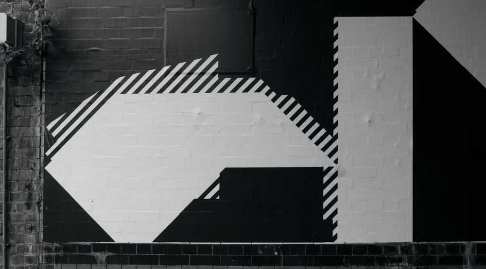
The studio has been working with Saville, who is creative director of the City of Manchester, on the branding since 2018. The original idea behind it was to build on the existing reputation of MIF, the legacy of Factory Records (the record label co-founded by the designer in 1978), and the creative heritage of Manchester more broadly.Taking inspiration from the venue’s architecture and previous Factory Records visual identities, the logo represents a new factory where the art of the future will be made. The dynamic symbol will also continually evolve, much like the use of the building itself.
The logotype, a monospace cut of Gräebenbach by Camelot, is the same as that used by North for the last three Manchester International Festivals, and is designed to give “a machine-like functionality to the information”, says North.Gräebenbach has also been chosen for the rest of the typography; Mono Black uppercase is used to help headlines stand out, Mono Bold is used for the website, and support body copy from the same family is used in both Bold and Regular.
A vibrant colour palette appears across brand communications, with added flexibility for any colour to be used for the marketing of productions and events depending on the content. And a ticker tape information system is used on both the website and inside the building to create a consistent language to speak to audiences.

To celebrate the construction workers and manufacturers behind Factory International’s new home, North has also designed 1,500 unique album artworks for vinyl record and accompanying film, Factory Works. Created by artist Neville Gabie and musician Nabihah Iqbal, the record mixes industrial sounds with snippets of conversations and original electronic music.
Working with the Factory International in-house design team, the studio has been rolling out the new identity across event marketing, art direction, signage, uniforms, and digital, as well as collaborating with OMA on signage and other architectural elements.
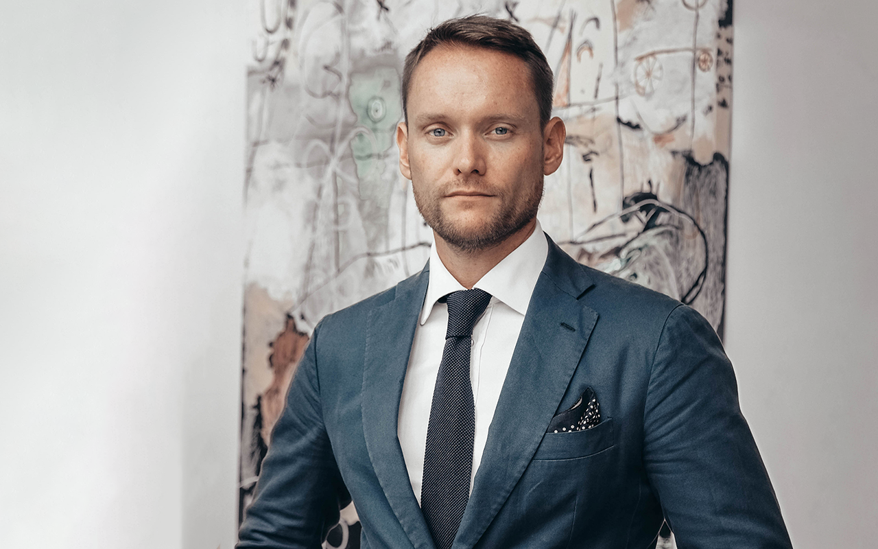
“I see Factory International, and its new home, as a two-way portal between Manchester and the world, through the broadest medium of the arts,” says Saville. “The world comes in through it and Manchester goes out through it. It is itself a signifier of intent and ambition, so it’s inspiring.”
https://factoryinternational.org
